Tuesday, 25 December 2012
Wednesday, 12 December 2012
A Transport of Delight!!
Can't say I was overjoyed initially with my song choice! Flanders and Swann? Who? A Transport of Delight? What??
Sounds like something Reeves and Mortimer would take the piss out of...hmmm...actually, could be interesting...my suspicions were confirmed when I googled 'Flanders and Swann.' 'Flanders and Swann were a British Comedy duo.' "Oh no! Not a comedy song! LAME!"
"Suppose I'd better have a listen then,"
Exactly what I thought, piano intro, 'Pathe' 'clipped British accents' rather jolly, chortle, chortle, Chumley Warner, how very amusing!
...and actually, rather charming...
...then I found this little gem...
A Journey by a London Bus
...and I am in love.
Thems were the days, a more innocent time, a more respectful time and a golden age of travel!
Ting ting! All aboard!!
And the song that chose me is....
So project 7 is upon us!...and it is entitled...'Storybook Songs'!
You are going to explore how a basic narrative form (simple CD book format with words and images) can be used to powerfully communicate emotion and personality to an audience. Book formats are a little like a sequence of individual frames from a short piece of film. When we digest information from a book we do it over a period of time, page by page.
Deliverables
Points to consider
And the song that chose me is.....
Flanders and Swann-A Transport of Delight
A Transport of Delight
Some talk of a Lagonda, some like a smart MG,
Or for a bonny army lorry, they'd lay them down and dee.
Such means of locomotion seem rather dull to us,
The driver...
... and conductor of...
... a London omnibus!
Hold very tight please, ting ting.
Hold very tight please, ting ting.
When you are lost in London, and you don't know where you are,
You'll hear my voice a-calling, "Pass further down the car!".
And very soon you'll find yourself inside the terminus,
In a London transport, diesel engine, ninety-seven horsepower omnibus.
Along the Queen's great highway, I drive my merry load,
At twenty miles per hour in the middle of the road.
We like to drive in convoys, we're most gregarious,
The big six-wheeler, scarlet painted, London transport, diesel engine, ninety-seven horsepower omnibus.
Earth has not anything to show more fair,
Mind the stairs, please, Mind the stairs... Mind the stairs...
Earth has not anything to show more fair, Any more fares?
Any more fares, any more fares?
When cabbies try to pass me before they overtakes,
I sticks me flippin' hand out as I jams on all me brakes.
Those jackal taxi drivers can only swear and cuss,
Behind that monarch of the road,
Observer of the highway code,
That big six-wheeler,
Scarlet painted,
London transport,
Diesel engine,
Ninety-seven horsepower omnibus.
I stops when I'm requested, although it spoils the ride,
So we can shout, "Get out of it! We're full right up inside".
We don't ask much for wages, we only want fair shares,
So cut down all the stages, and stick up all the fares.
If tickets cost a pound apiece, why should you make a fuss?
It's worth it just to ride inside,
That thirty-foot long by ten-foot wide,
Inside that monarch of the road,
Observer of the highway code,
That big six-wheeler,
Scarlet painted,
London transport,
Diesel engine,
Ninety-seven horsepower,
Ninety-seven horsepower omnibus!
Hold very tight, please!
It is completely different to the way we take in information from billboards, magazine ads or, as in the case of digital music, postage stamp-sized iPod icons. As with film, we also have the possibility to surprise or challenge our reader, as they just don’t know what will be on the page that follows the one they’re looking at. You can employ variation to keep them interested or bore them to death with page after page of repetitive uniformity…
1. Six page CD ‘booklet’ insert – 120mm X 120mm
including the song title and artist on the topmost
page. Jewel Case Back card – 118mm high X 150mm
wide (each spine is 6mm wide) including the artist and
title on each spine. Digipak and custom-made designs
have a maximum dimension of 125mm high X 142mm
wide although there is no restriction on thickness of
the spine.There is no restriction on the size of associated
packaging.
2. Research and development work showing the
journey to final artwork remains an important element
of the assessment process.
3. Your completed (apart from the final section) self
reflection form
Points to consider
Like an actor playing a part, your treatment of the
lines should be believable and true to the original
artist’s intentions. At worst your design should
complement the experience of listening to the song,
at best it should positively add new dimensions to the
experience!
If you were an actor reading these your song’s lyric as
lines on stage you would be expected to have:
1. Explored and understood the lyric’s meaning (are
the words used literally or metaphorically?)
2. Found a point of view or tone of voice that
represents the lyric effectively
3. Brought something of your own experience
and personality to the performance - what special
‘something extra’ does a good actor bring to the part
they are playing?
You should exploit the unique possibilities of format
in enhancing such things as the drama, pace, humour,
mood and meaning of the written/sung words.
Your final piece has the potential to be both interactive
and tactile. Think about materials and surfaces and
how they can hugely enhance the viewer’s sensual
experience.
Consider changing the format of ‘spreads’ by including
‘gatefolds’ and ‘fold outs’; binding in different types/
colours of paper/materials; cutting the page (holes,
slicing the edge etc.); utilising accordion folding etc.;
pop-ups; ‘tipping in’ (sticking things on to the page);
employing a slipcase.And the song that chose me is.....
Flanders and Swann-A Transport of Delight
A Transport of Delight
Some talk of a Lagonda, some like a smart MG,
Or for a bonny army lorry, they'd lay them down and dee.
Such means of locomotion seem rather dull to us,
The driver...
... and conductor of...
... a London omnibus!
Hold very tight please, ting ting.
Hold very tight please, ting ting.
When you are lost in London, and you don't know where you are,
You'll hear my voice a-calling, "Pass further down the car!".
And very soon you'll find yourself inside the terminus,
In a London transport, diesel engine, ninety-seven horsepower omnibus.
Along the Queen's great highway, I drive my merry load,
At twenty miles per hour in the middle of the road.
We like to drive in convoys, we're most gregarious,
The big six-wheeler, scarlet painted, London transport, diesel engine, ninety-seven horsepower omnibus.
Earth has not anything to show more fair,
Mind the stairs, please, Mind the stairs... Mind the stairs...
Earth has not anything to show more fair, Any more fares?
Any more fares, any more fares?
When cabbies try to pass me before they overtakes,
I sticks me flippin' hand out as I jams on all me brakes.
Those jackal taxi drivers can only swear and cuss,
Behind that monarch of the road,
Observer of the highway code,
That big six-wheeler,
Scarlet painted,
London transport,
Diesel engine,
Ninety-seven horsepower omnibus.
I stops when I'm requested, although it spoils the ride,
So we can shout, "Get out of it! We're full right up inside".
We don't ask much for wages, we only want fair shares,
So cut down all the stages, and stick up all the fares.
If tickets cost a pound apiece, why should you make a fuss?
It's worth it just to ride inside,
That thirty-foot long by ten-foot wide,
Inside that monarch of the road,
Observer of the highway code,
That big six-wheeler,
Scarlet painted,
London transport,
Diesel engine,
Ninety-seven horsepower,
Ninety-seven horsepower omnibus!
Hold very tight, please!
Tuesday, 4 December 2012
Excerpt from 'The Madness of Peter Howson'
Artist destroys his own painting-Youtubehttp://youtu.be/EkOsUF8AUhA
Peter Howson-A Perspective


http://curiouspresbyterian.wordpress.com
Above are two paintings by 'theological' painter Peter Howson.
According to Wikipedia 'Theology (from Ancient Greek Θεός meaning "God" and λόγος, -logy, meaning "study of") is the systematic and rational study of religion and its influences and of the nature of religious truths, or the learned profession acquired by completing specialized training in religious studies, usually at a university or school of divinity or seminary.[1]'
I prefer to refer to him as Peter Howson, painter, not due to my personal feelings about religion, but because I'm sure he would not refer to himself as a 'theological painter.' Who would?
I discovered the work of Peter Howson due to a BBC documentary which chronicled his life and near break-down during his attempt to complete a commission from the church to paint The Martyrdom of St John Ogilvie, a Scottish Saint.
Peter Howson,OBE was the official painter of the Bosnian War, a former drug addict and alcoholic he 'found God' in 2000.
His work is dark, often depicting the ugliness, desperation and despair of humanity, but rendered in a sublime, ethereal way.
He uses light, shade and perspective to dramatic effect and the grotesque, bulbous, anatomical representations of the subjects of his works echo the horror of war and the bloated, twisted minds and egos of the men who create it.
Peter Howson is from a rough, tough world. Born in London and raised on the mean streets of Glasgow in the 70's and 80's, the characters he portrays are characatures, but they are also brutally real. Their eyes speak of sadness and madness...and knowledge, and pity.
I think they are beautiful. An honest study of the human figure, and regardless of my views on religion, I still believe that religious texts are part of the human story, a commentary on all facets of the human condition; life, love, death, greed, hate, jealousy, ignorance, hope, glory, determination, the search for eternal happiness and the fight against damnation.
Howson's paintings are dark and light, soft and hard, damning and forgiving, beautiful and ugly.
If religion is what gets him out of bed in the morning, then who the hell are we to judge?!
Sunday, 2 December 2012
Thursday, 22 November 2012
CREATIVE's BLOK: Official Warning Signs
CREATIVE's BLOK: Official Warning Signs: Photography research on the streets by D . See more here . ...
Wednesday, 21 November 2012
Kate and Eilidh do science...
Project number 5, 7 steps to enlightenment, 2 partners, 10 days, 1 question...
How does a Sat Nav work??


Not quite.
It's actually rather clever, and interesting! In order to find out how Sat Nav works, we need to find out, not only how a Satellite Navigation Receiver works, but also how GPS (Global Positioning System) works, and therefore, how GPS satellites work! It's all very sciency and techy, and luckily, I am a wannabe science geek, so find it all fascinating. This project has allowed me to indulge my love of art (we must illustrate our findings in 7 easy steps) and science! Cool beanz!

And here's the science bit! The answer involves 'Ephemeris data', 'Almanac data' and 'Pseudo Random Code.' In the most basic terms, the receiver is activated when it picks up the signal from 4 satellites (of which there are 24 orbiting the Earth, each emitting a continual signal, unique to each satellite.) The Satellites 'triangulate' or to use the correct terminology, 'trilaterate' the receiver's location, taking into account latitudal and longitudal co-ordinates, and attain accuracy due to their on-board, synchronised atomic clocks. On activation, the receiver selects the relevant map from it's software, and the hardware utilises previously installed settings to communicate the information to you, the driver, via a computer screen and audio instructions!!! And voila! Fanny's your Aunt and Robert's your Mother's Brother!!
Capiche?
Sunday, 18 November 2012
Street Tart
Street Art-Contemporary Prints from the V & A

 This street tart went to see some street art yesterday. Except it wasn't on the street. And therein lies the problem. This was artwork by street art and graffiti artists from around the world, presented out of context, not in it's gritty home in the favelas of Brazil or the arrondisements of Paris, but displayed very nicely and orderly on the clean, white, clinical walls of an art gallery in Carlisle. I felt that with the absence of a cultural setting something was lost. Instead of being 'street art' this was just 'art.' Don't get me wrong. Some of it was very nice art. The very nature of street art is that it 'lifts' iconic images and juxtaposes them to create meaning, perhaps I am jaded but I just felt that I'd seen it all before. It felt somehow, lazy. Perhaps I am missing the point. Perhaps this exhibition was about bringing 'classic' street art images to Carlisle, I suppose when these images were new, they were groundbreaking and set the stall for other aspiring artists from disadvantaged areas. But when the images are painted on canvas instead of brick, and screen printed on silk instead of stencilled on a wall, they become just another magazine spread or funky shoe box, instead of a comment on social and political injustice or an endeavor to elevate an existence or make a mark on the world.


Wednesday, 14 November 2012
Tuesday, 13 November 2012
Goodbye to the 90's!
Aaaaand relax! That was the month that was, and what a bloody month! What started off as a seemingly inocuous task to create and design a character from a given decade turned into a foray into the world of games design, an experience I do not wish to repeat!!
Oh yes, it was all so lovely and fluffy in the beginning! A trip down memory lane. A visit to my old stomping ground. I couldn't believe my luck when of all the decades I could have been given (namely the 20's, 30's, 40's, 50's 60's or 70's, not the 80's, the 80's were different, the 80's were special, no-one got the 80's!) I got the 90's! I mean, how hard could it be to find out stuff about the 90's, I was there! It was my time!
I was at secondary school from 1990 to 1995. So my early teens, my formative years were in the first part of the 90's. In the second part of the 90's, 1996 to 2000 I was 16 to 21. It really was a decade of two halves for me. The culture and world events that took place in the 90's were really real for me. The music and the fashion that we were researching was my music and my fashion. I loved Oasis. I wore 'grunge.' I wanted to be Gwen Stefani. They were good times, although you never really realise it at the time! All we had to worry about was school, seeing our friends and occasionally, homework. And we had a laugh. Looking back it seems like all we did was laugh! And there was lots to laugh at, our teachers were like caricatures of teachers, the science teacher with the comb over, the French teacher with sweaty 'pits, the very odd sports teachers of dubious gender!
And we used to ridicule them mercilessly, not to their faces of course, we weren't the 'bad' kids.
But we did discover drink, (and boys!) in about year 9, aged about 14. We had friends with 'decks' and there wasn't a week went by when someone wasn't having a house party and we'd get dropped off by our 'unsuspecting' parents for 'sleepovers' at some other 'liberal' parent's house with ruck sacks and coat sleeves clinking and bulging with drink! However, somehow we left school with good grades at the end of it.
There was a long hot summer the year we left school, and I'm not looking back through rose-tinted specs, it really was the best summer ever! We sunbathed all day with the tunes blasting out on the radio. The parties continued and we gave some consideration to what we were going to do next. Not too much of course!!
Aged 17 I started working in my Uncle's pub, 'The Whitehouse.' It was the place to be at the time, one of the busiest pubs in town, my best friend worked there as well and we were right in the thick of it. At that age it was a fun place to be, we used to get to jump the queue to get into Buskers and get in for free, of course, living that lifestyle was not conducive to operating in a normal fashion and it was all consuming. Further education went out the window and sixth form got shelved. It's only taken me 16 years to get back on track, but I don't regret a second of it; learning to drive, leaving home, moving in with my first proper boyfriend and working in Majorca with my best mates for a year all followed before the 90's were out.
As for the games design bit, remember that before I started remeniscing? I get it. I get why it was useful, I think we worked well as a team, and credit is due to each and every team member for their individual input, I let the team down as Project Leader with my poor time management and wish we could have executed our concept better, perhaps the team was handicapped due to the 2 old people (sorry Alex!) with their inability to grasp basic Photoshop, but I still think our concept was a good one if not a moralistic one! Who are any of us to judge!!? I know myself, what I have learnt and what I would do differently were I to do it again. But I can honestly say, it is not games design that gets my juices flowing! So just as this project is put to bed, it is time to put the 90's to bed. I look back on it fondly, it made me who I am, but it's time to look the future and all it has to offer. Bring it on!!!
Wednesday, 7 November 2012
I'm no celebrity, but get me out of here!!!
To say I am struggling with Photoshop would be an understatement. It's just taken me 5 and a half hours to put a cut out of a paper plane on a cream background. I am losing the will to live. And I picked this week to go on a no beer diet. I'm no celebrity, but get me the fuck out of here!!!
Tuesday, 6 November 2012
The battle against shit war film movie posters!


In my quest for knowledge and inspiration as to what makes a good war film movie poster I came across these.
These do not make good war film movie posters, and yet, seem to be a formula that Hollywood sticks to.
I see a pattern; horizon/battlefield/silhouette + moody sky and/or big faces = pile of garbage
Monday, 5 November 2012
They are big on posters in Amsterdam-yesh!
So here we are, project 4. Design a poster to promote your 'movie' from project 3. I know these aren't movie posters, but they are posters that I have seen with my eyes and documented with my camera on a trip to Amsterdam. I love Amsterdam, and I love posters. As we were told in our lecture today, some of the greatest graphic artwork has been in the form of posters...I will keep you posted with more posts about posters...
 |
| Club night posters |
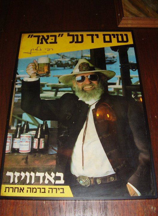 |
| Photographic Budweiser Beer poster...I think! |
 |
| These posters adorned the wall of a cafe, you often see this in Amsterdam, a constantly changing wallpaper, like a living, breathing entity! |
Thursday, 1 November 2012
Tuesday, 30 October 2012


Wednesday, 17 October 2012
Advanced Typography and Publishing Design: Rockwell Font Critique - Rachel Brex
SDES2198 Advanced Typography and Publishing Design: Rockwell Font Critique - Rachel Brex: The Rockwell typeface is a slab-serif or “Egyptian” font that was heavily influenced by a font face called Litho Antique in 1910. Due to...
Sunday, 14 October 2012
Top Typo.
 |
| Explosive! |
 |
| Don't know who Tony Rohr is but this poster's cool as... |
 |
| ...Wooden Helvetica... |

Massive M

Flora n Fauna

Steampunk Style

Constructed out of Cardboard

On a Hill


Rock-hard Rockwell
I have struggled to find examples of Rockwell Bold.
Rockwell was based on an earlier font, Litho Antique, created by William Schraubstadter in 1910.
Rockwell belongs to the 'Slab Serif' classification, so called because the serifs are sturdy and 'slab-like' without brackets connecting the serif to the stem.
Litho Antique became popular in Europe in the late 1920's and so was re-issued. Supervised by Frank Hinman Pierpoint at The Monotype Foundry's in-house design studio, new characters were added to the original Litho Antique and the modified result was 'Rockwell Antique' released in 1931.
Rockwell Bold is often confused with a similar type-face, 'Stymie Extra Bold' which is used by The New York Times for headlines in it's Sunday magazine.
 |
| This font looks like Rockwell.... |
 |
| ...however, the G in this image has a tail which is not present in Rockwell type which makes me think it may be Stymie Extra Bold or Litho Antique. |
 |
| This font has been chosen to promote the food offer in 'The Hungry Horse' pub. The food here is very much in the American style of sizzlin' platters, ribs, corn on the cob and steaks, very masculine and unsophisticated, real cowboy food! |
Gill Sans, the right type for LNER.
Gill Sans type was designed by Eric Gill in 1926. It was later developed into a full font family and commissioned to be used as a unique typeface for London and North East Railway's posters and publicity material.


Subscribe to:
Comments (Atom)